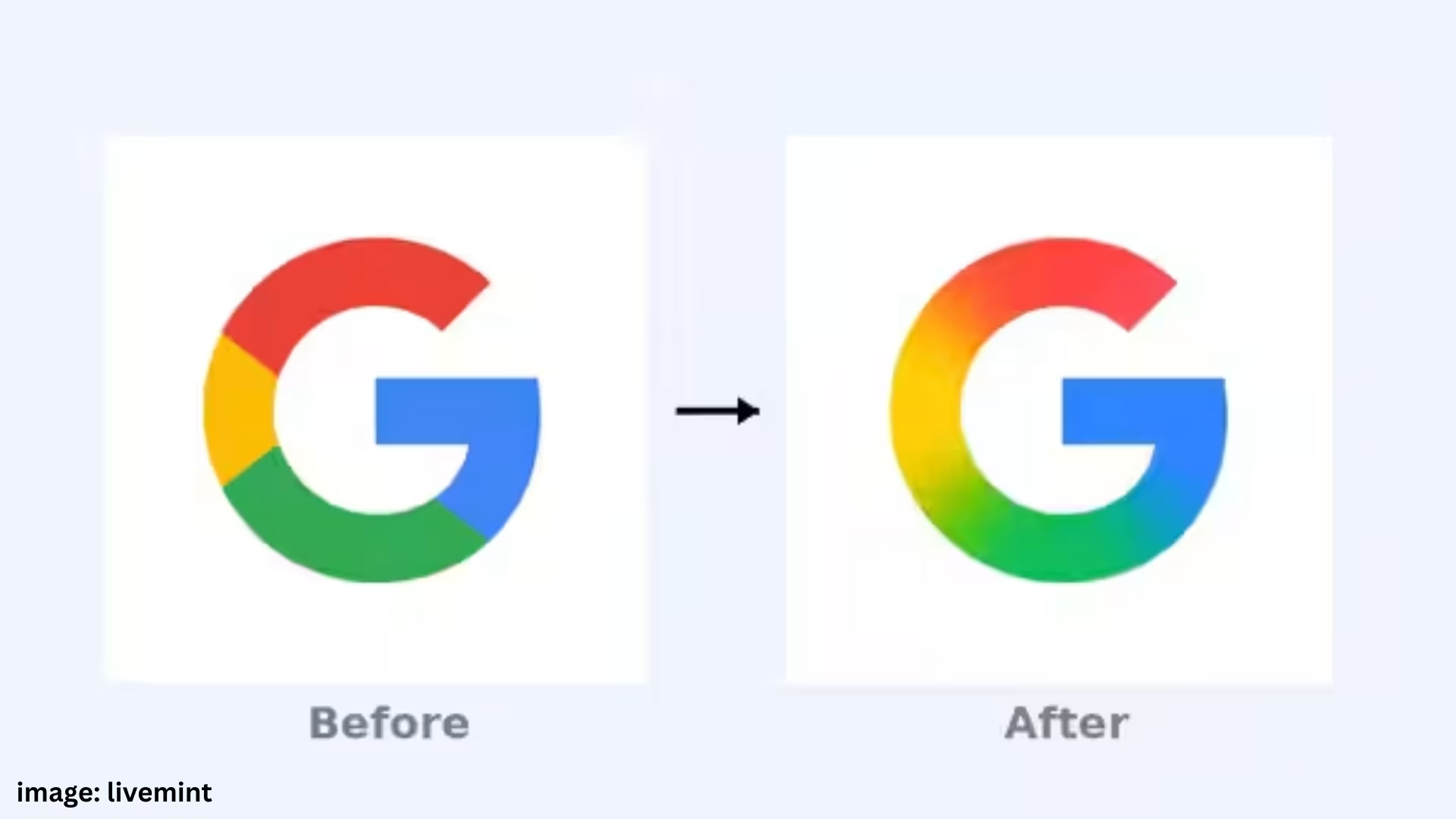
Google has made a big change to its iconic ‘G’ logo after almost a decade. The new logo now comes with a gradient design, which improves color balance and depth.
Google has changed its ‘G’ logo for the first time since 2015. While earlier this logo used to come with four solid colors (red, yellow, green, and blue), now the new logo features these colors in a gradient effect. Its aim is to make the logo more balanced, modern, and visually appealing.
Rollout started on iOS, likely to come on Android soon
This new logo has started appearing first on Google’s iOS app. At the same time, this update has also been included in the 16.8 beta version of Android. However, Google has not yet clarified whether this new logo will also be implemented in other apps like Chrome, Maps or the logo of the entire word ‘Google’.
An attempt to refresh the brand image in the AI era
Although Google has not officially stated why this change was made, it is believed that this is an attempt to reflect the company’s new brand identity, especially at a time when Google is rapidly increasing AI integration in all its products.
Google’s Gemini AI is now included in platforms like Search, Gmail, Docs, Drive, Keep, Tasks, and Calendar. With updates like Gemini 2.5 Pro, it is giving tough competition to ChatGPT.
When did the Google Logo change before?
Google last changed its logo in 2015, when it removed its identity from just a search engine and established itself as a multi-platform tech company. At that time, the company changed from serif typeface to sans-serif and introduced a colorful ‘G’ logo in place of the lowercase ‘g’.


![X (formerly Twitter) experiences sudden outage: Global outage frustrates users, service now restored [Update]](https://www.siyaramseoservices.com/wp-content/uploads/2026/01/X-formerly-Twitter-experiences-sudden-outage-Global-outage-frustrates-users-service-now-restored-Update_converted-360x240.avif)


